Pushpay
Another redesign via FFW. Pushpay’s primary goals were to play down their past, exclusive, faith-based affiliations so they would appeal to other companies/markets, bring the design in line with their new corporate branding guidelines, and to improve the UX of the entire site.
The project began with an all day on-site discovery session with the Pushpay team. Next, my design partner and I collaborated on wireframes. Finally I took those wireframes and turned them into full-fledged comps.
See it live here.

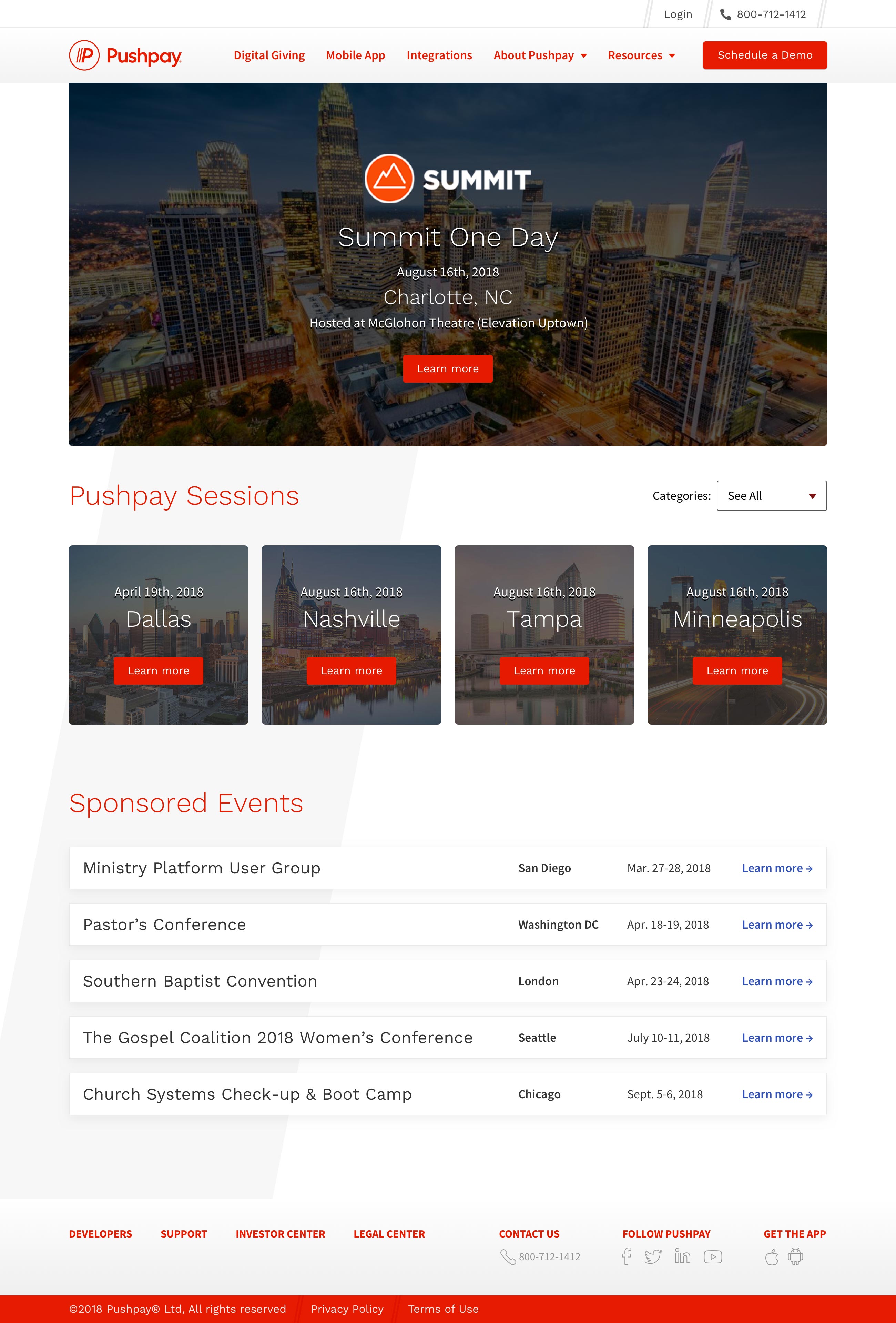
Image one: The new events page

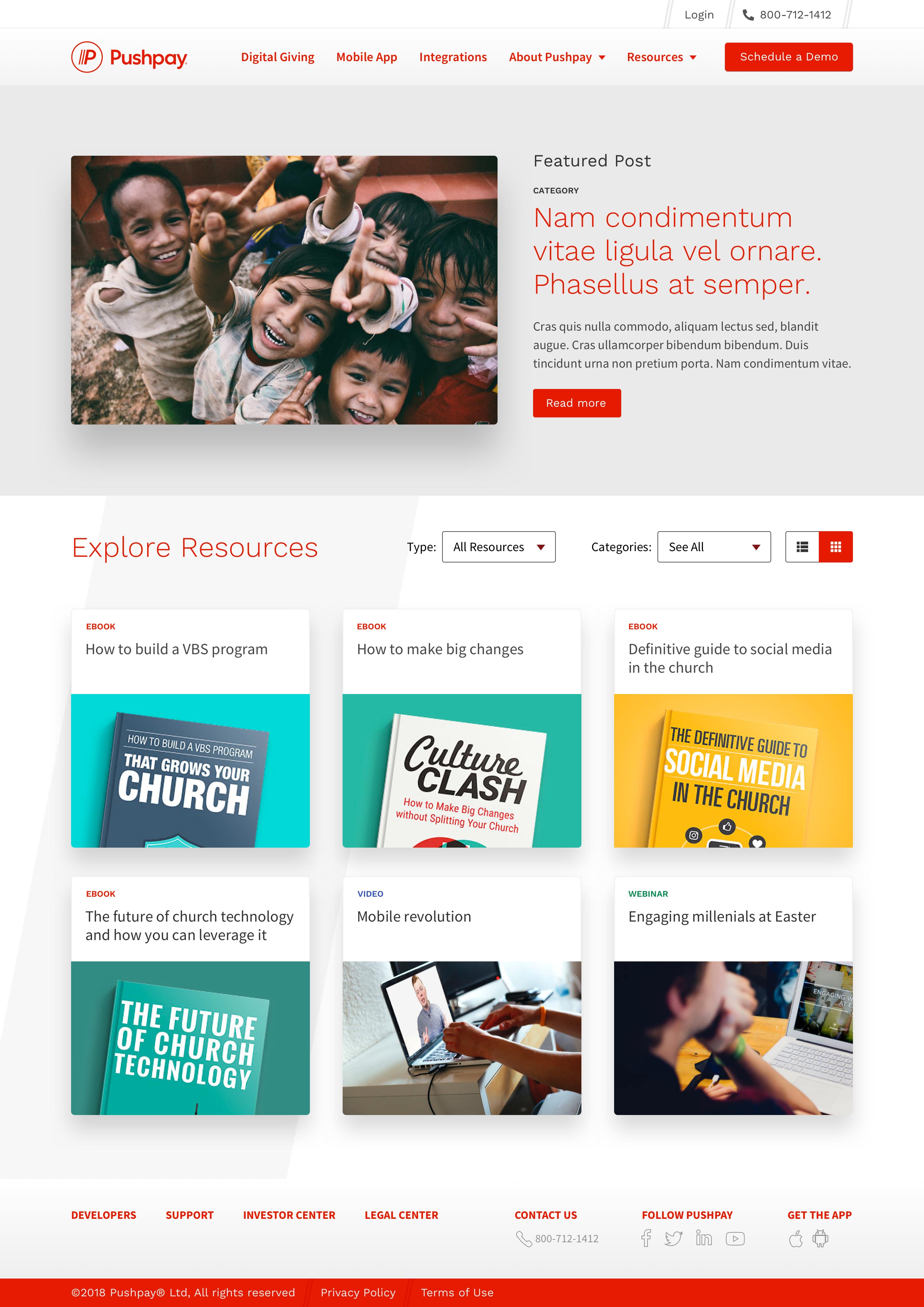
Image two: The new Articles landing page

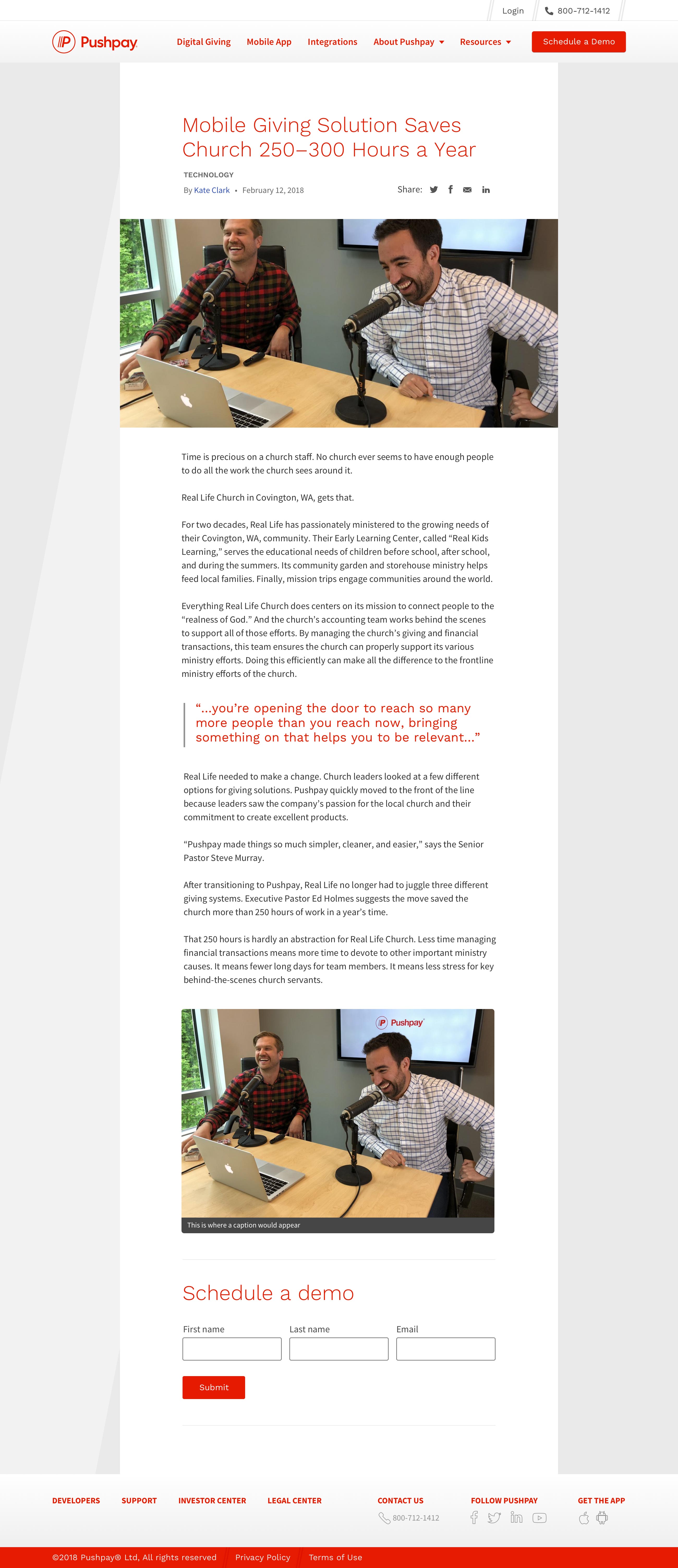
Image three: The new article detail page

Image four: The old Events page

Image four: The old Articles page