Pfizer Brazil – Muito Bem Vindo
Pfizer Brazil tasked FFW with a rework of one of their flagship websites. Primary goals were to bring the design in line with existing corporate branding guidelines, and to improve the UX of the entire site for each of the main users – patients, nurses, and physicians.
I provided the visual design, as well as any UI work that wasn’t explicitly spelled out in the wireframes (which was a lot).
See it live here.
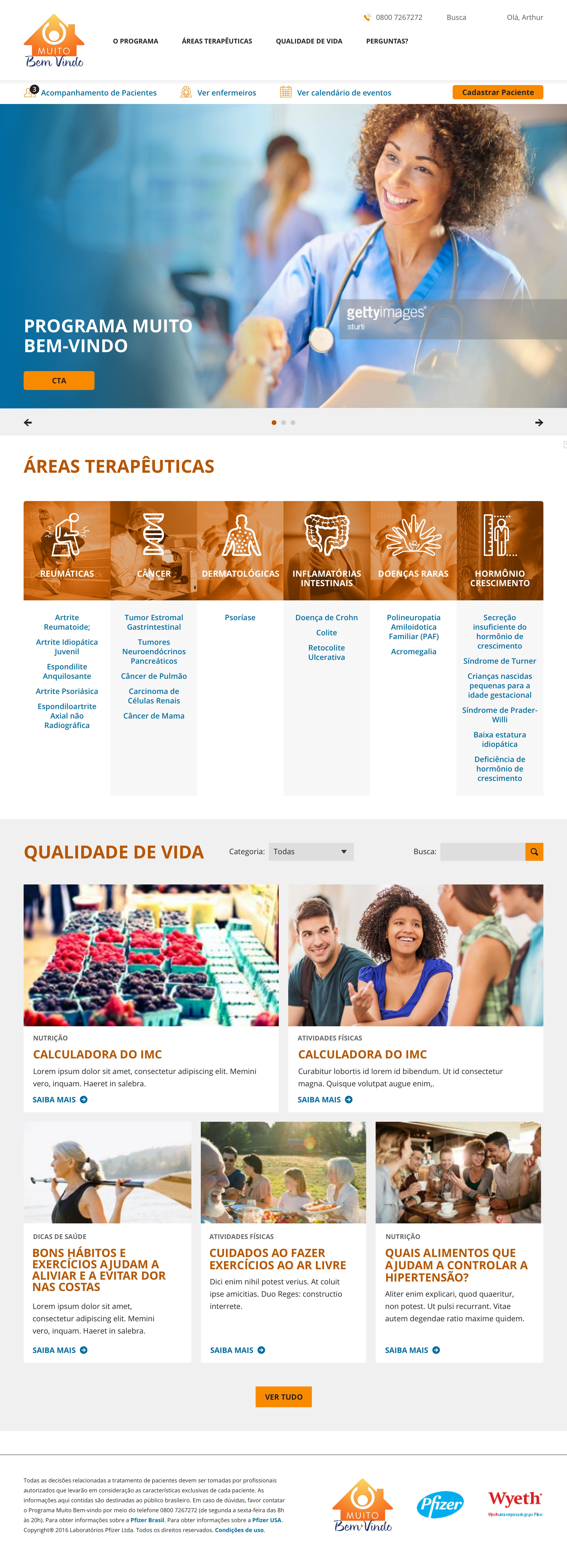
Image one: The new MBV homepage
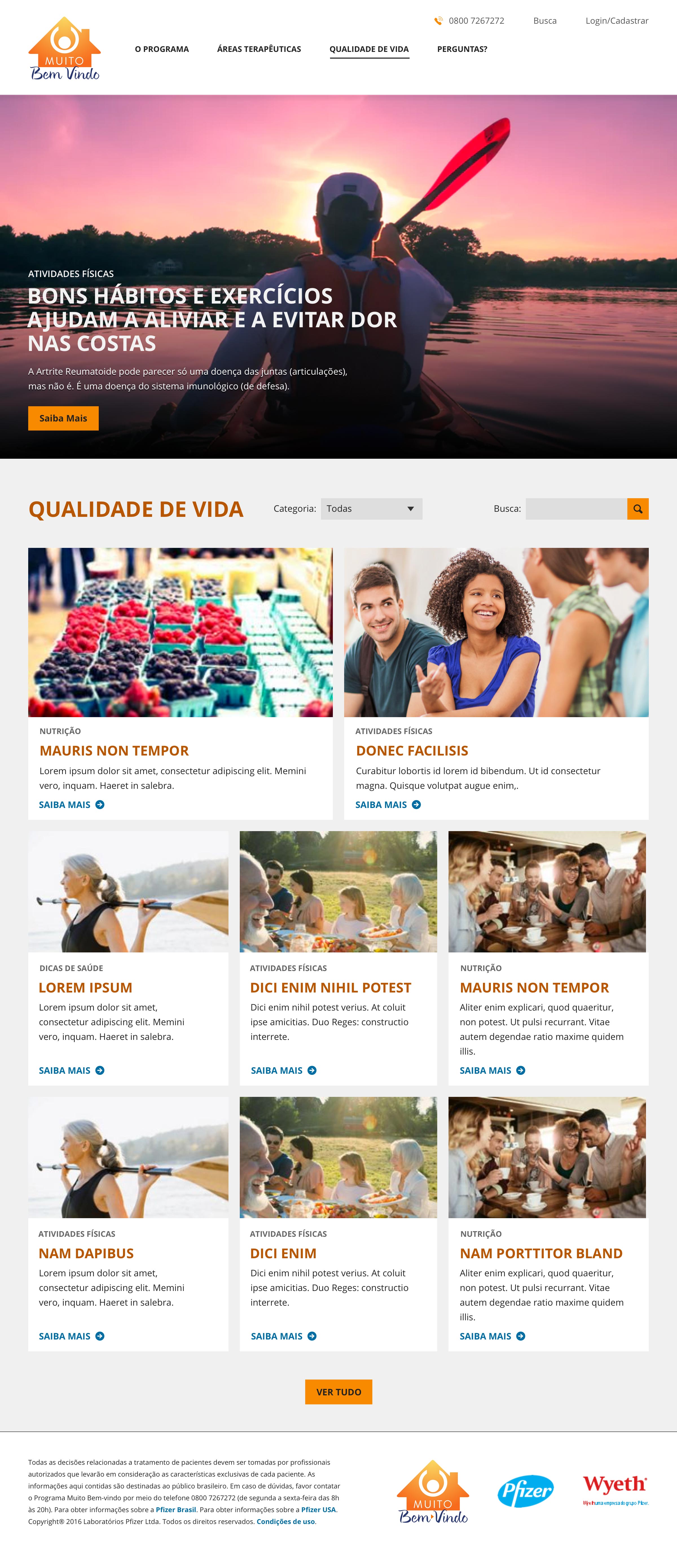
Image two: The new Articles landing page

Image three: One of the new patient pages
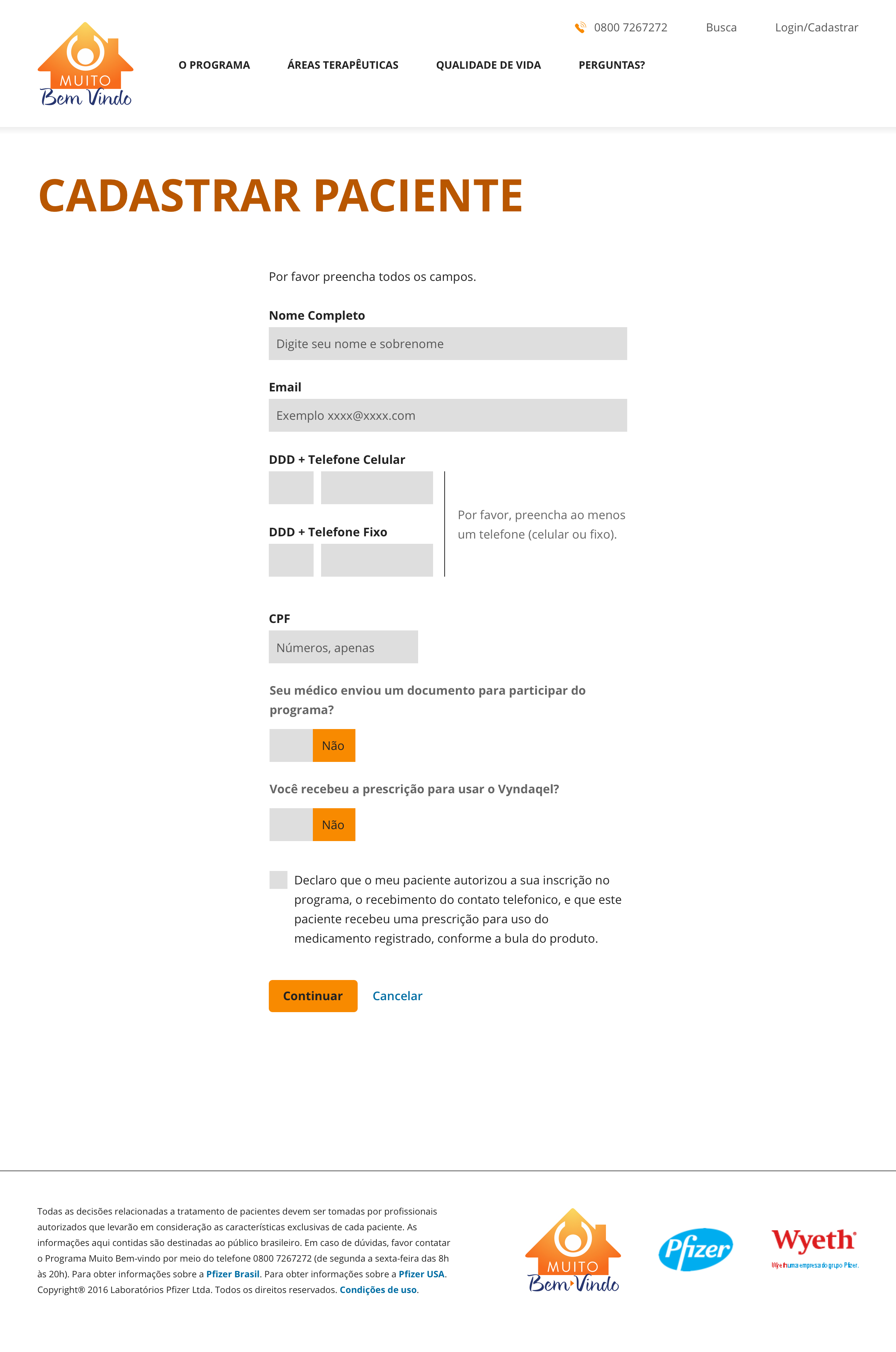
Image four: Example of one of the new patient registration pages
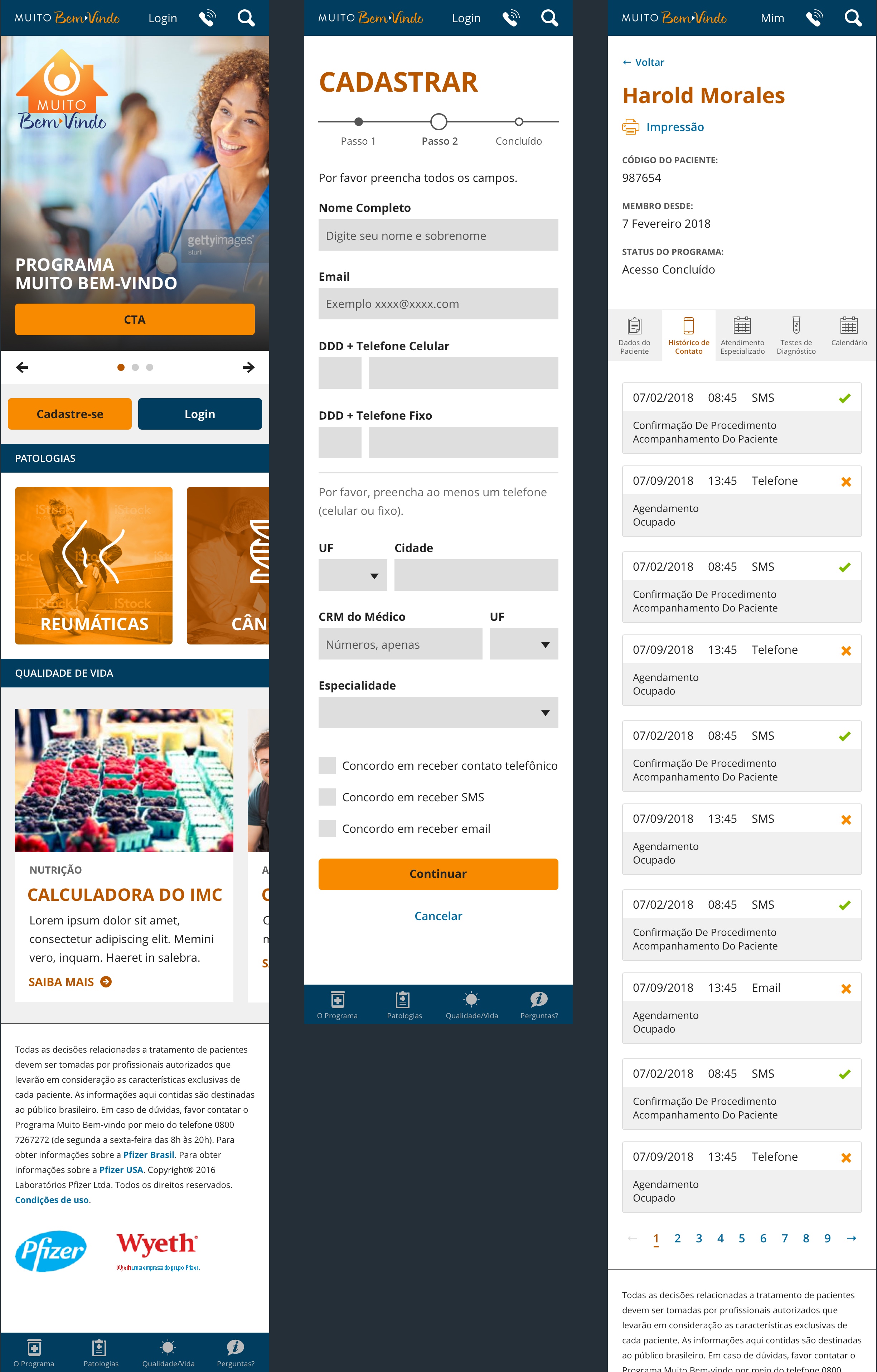
Image five: Examples of the new mobile pages
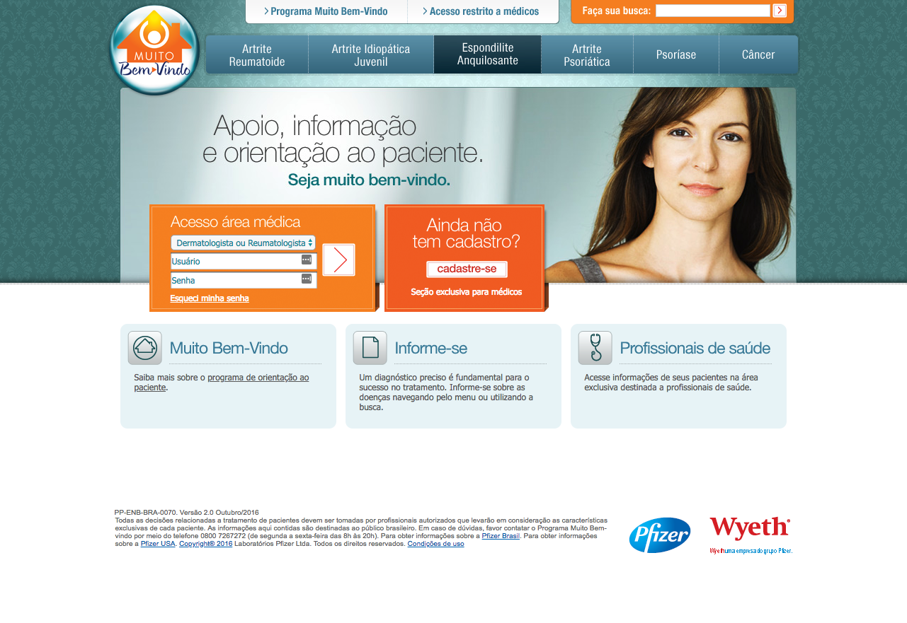
Image size: The old MBV homepage
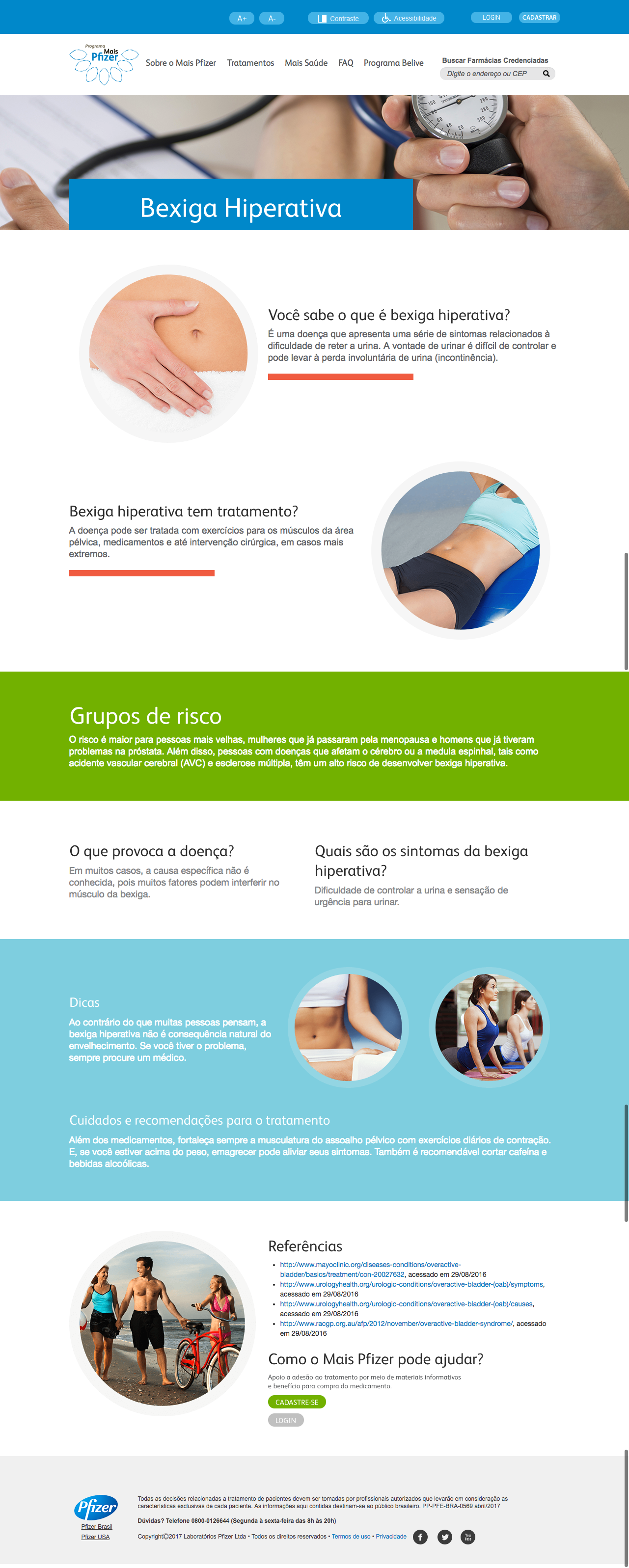
Image seven: The old MBV articles page