Pfizer Medical Information
Another Pfizer/FFW collaboration, the Medical Information site is an important repository for everything you could want to know about the medications that Pfizer offers. The old site was getting very long in the tooth, both technically and visually, and the UX left a lot to be desired, leaving doctors and patients equally frustrated. Our team began the process of a complete redesign in the fall of 2019.
The project kicked off with three days of on-site workshops held at the NYC headquarters. Following the user-centered design process, we worked together with the Pfizer team to capture business goals, personas, customer journeys, etc. Next, we moved on to high-fidelity wireframes. Lastly, we finished up with design comps (all done by yours truly).
Content strategy was one of the first problems we addressed. The drugs themselves were difficult to find, and the information on each drug page was poorly structured. Next we focused on improving the search engine and results, making them much easier to parse.
This project was especially challenging because of all of the legal restrictions regarding what can and can’t be displayed country by country. (e.g. Only showing search results if they put in the exact keywords!) And, knowing that the site would eventually be translated into dozens of languages added to the fun.
All in all I’m especially proud of these designs, and feel it’s a huge improvement over the old site.
See it live here.
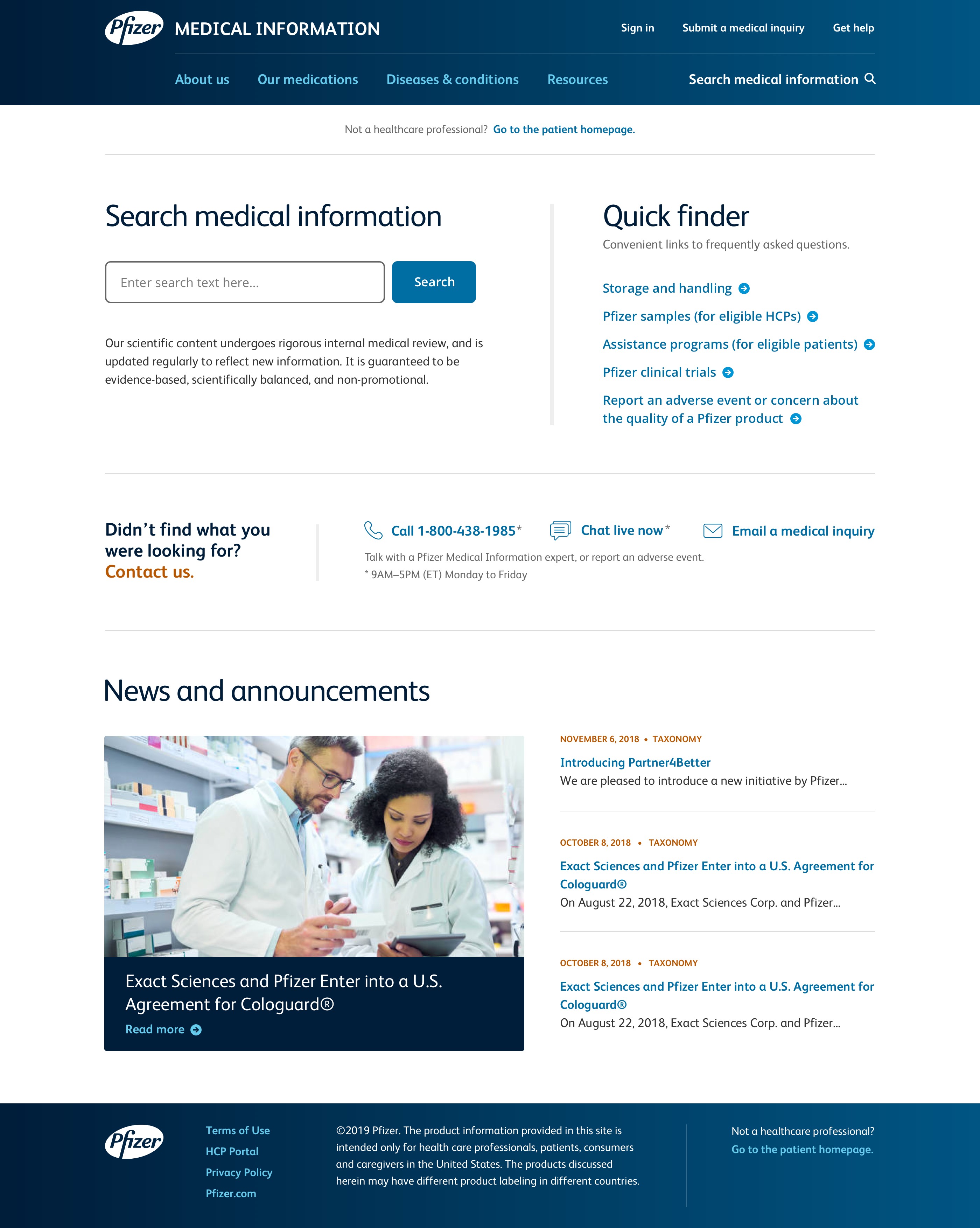
Image one: The new HCP home page
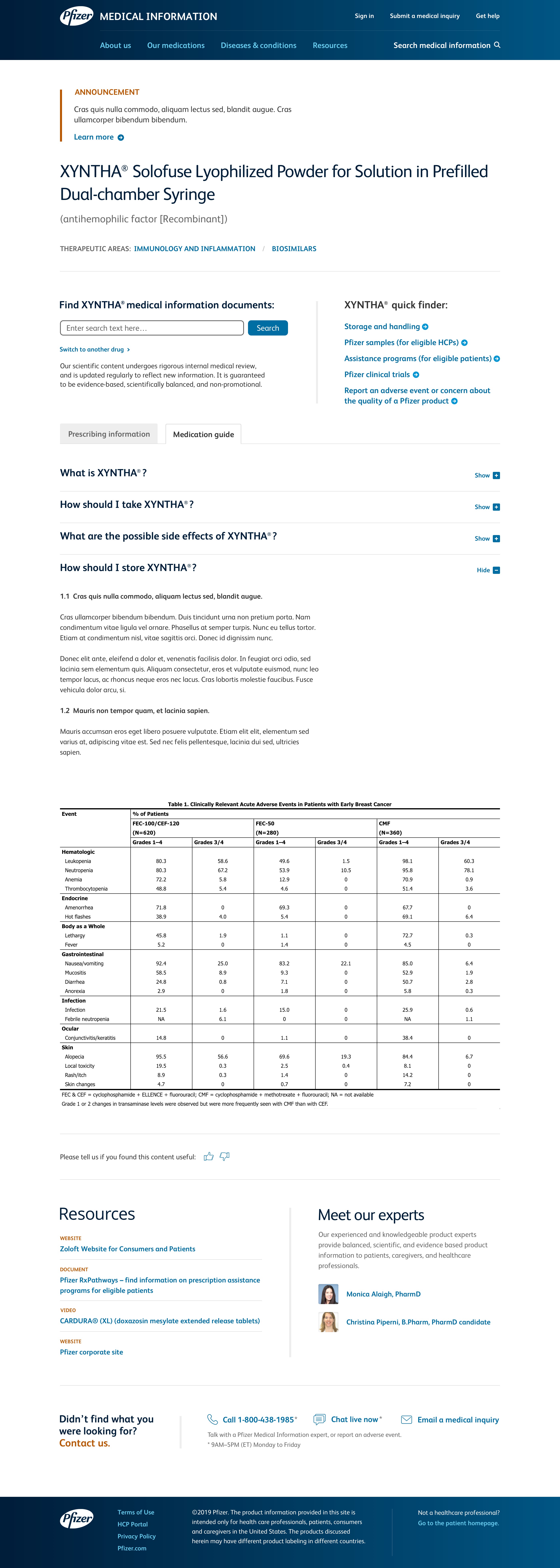
Image two: A new drug landing page
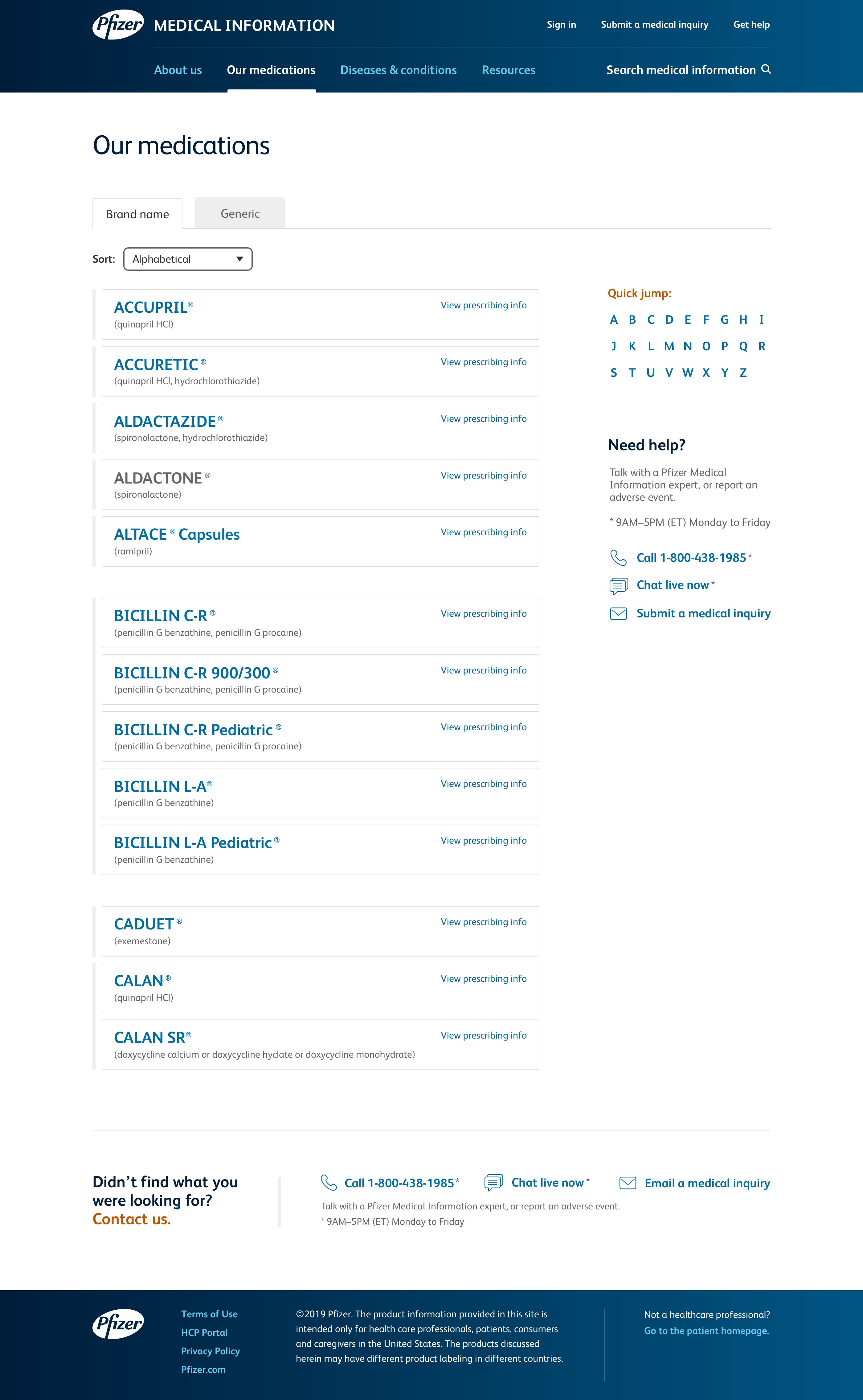
Image three: The new medication listing page
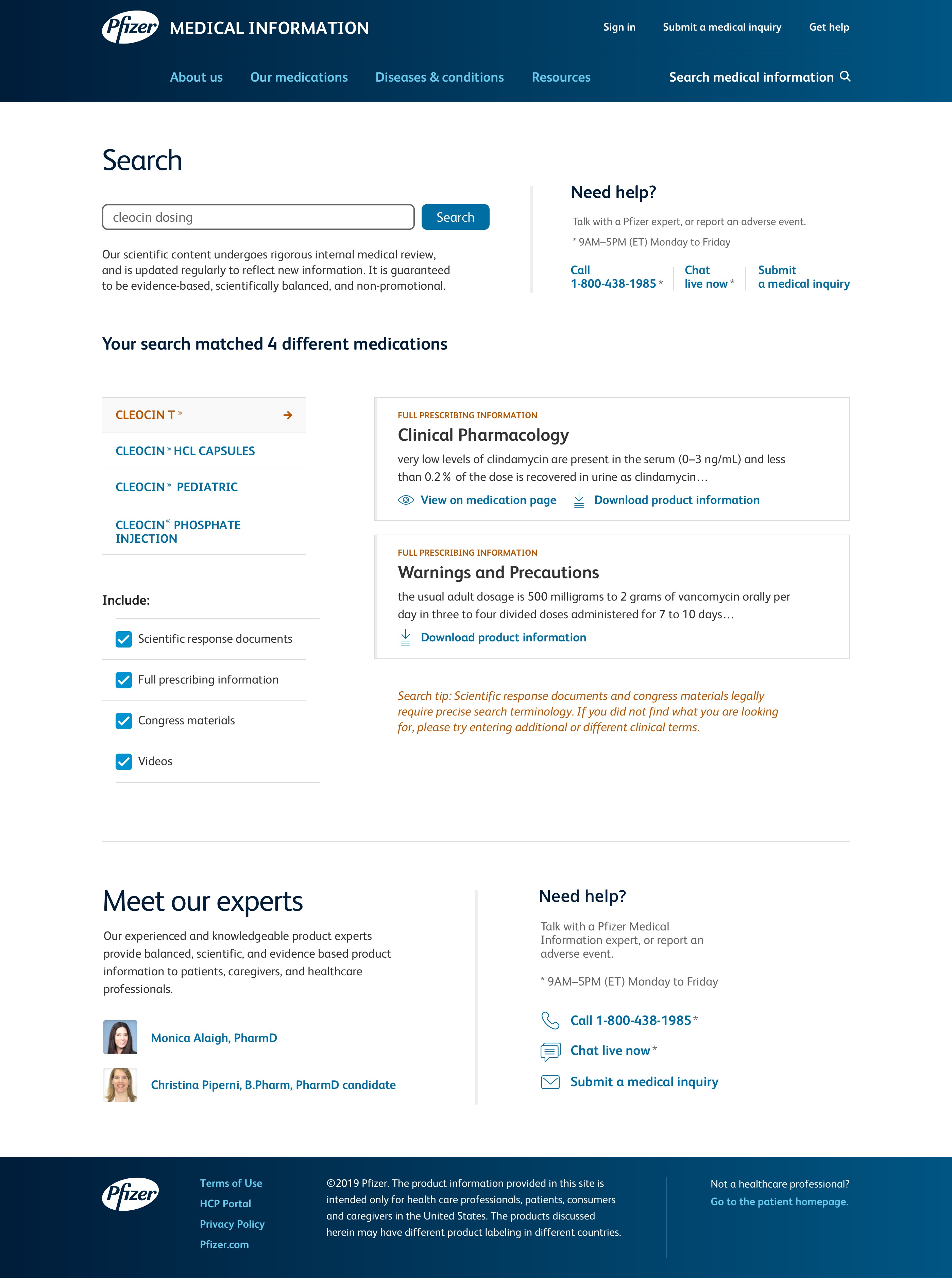
Image four: The new search results page
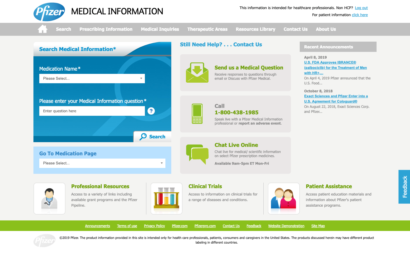
Image five: The old home page
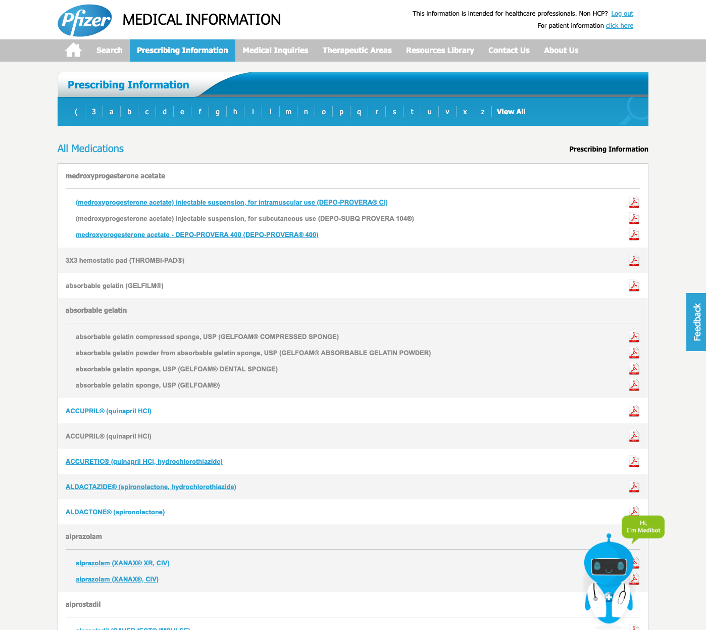
Image six: The old medication listing page