Treasure Valley Community College redesign
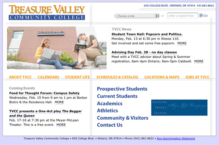
Begun in spring of 2010, the TVCC redesign is one of the funnest projects I’ve had yet. With their website approaching 8+ years old, TVCC knew they needed a redesign. Thankfully, they had the foresight to realize a new coat of paint wasn’t going to be enough; ease of use had to be priority #1.
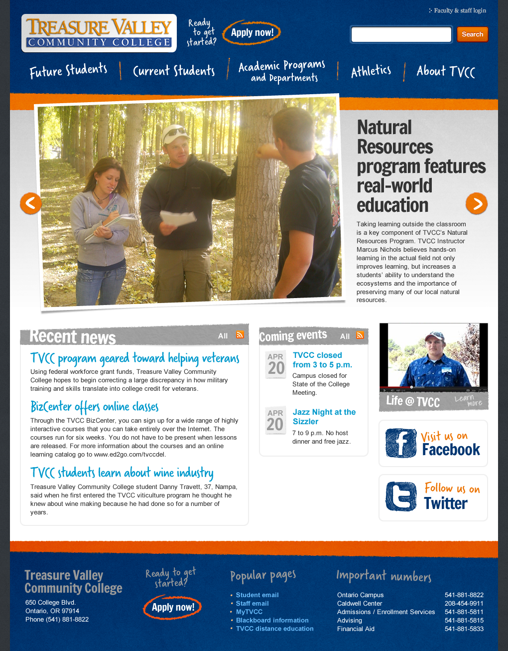
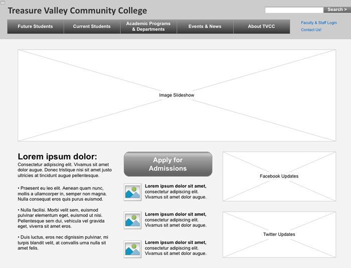
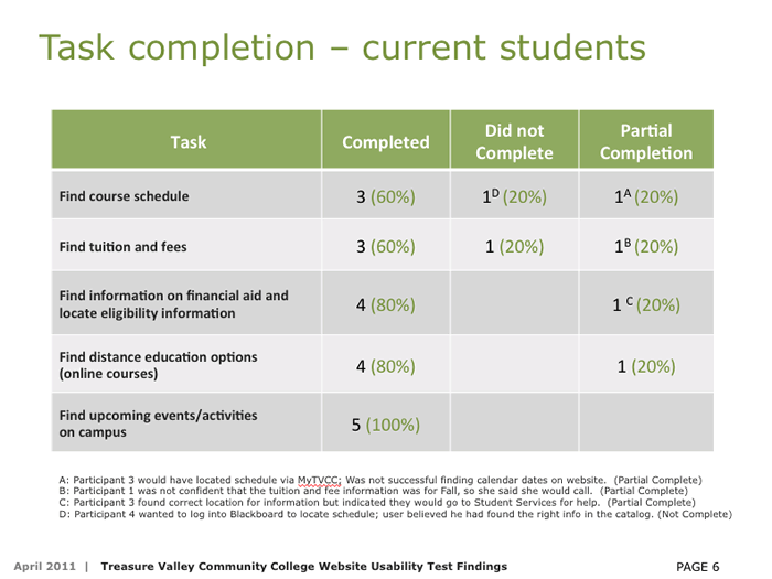
Given the scale of the project, I decided to bring in UX researcher Gary Anderson to help with the heavy lifting. We kicked off the project with an on-site usability test (led by Gary) where we learned how faculty and students were using the current site. With the data we took away from the test, we worked out the new architecture of the site, moved on to wireframes, and ended the ID phase with interactive prototypes for testing. Once we were satisfied we had the interactions nailed down, I moved on to the visual designs. TVCC was thrilled with the results and completed the development in-house.

Image one: The new home page.

Image two: A screen shot of the interactive prototype

Image three: Screenshot from our report covering the results of the usability testing

Image four: the old home page