Memolane
I began working with this awesome startup in June 2011, and spent nine months collaborating on various parts of their desktop app. While the overall look and feel (dark colors, light memos, and the top bar) were already defined, or carried over from the previous version, I had many opportunities to determine the interaction and visual design of the app. During that time, I also had the privilege of designing their Android app from the bottom up. (Released March 2012.)
Projects were broken into weekly sprints, and I would begin with rough wireframes, move on to hi-fidelity wireframes, and finally finish with visual designs. All the while working closely with the CEO and lead developer on the interactions.
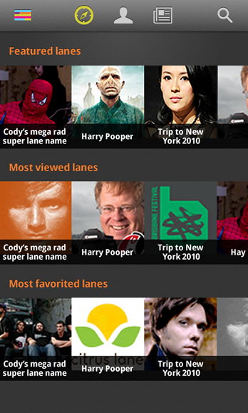
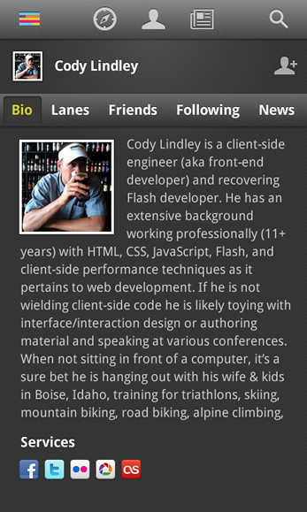
Image one: The explore page in the Android app. Image two: A users profile page in the Android app.
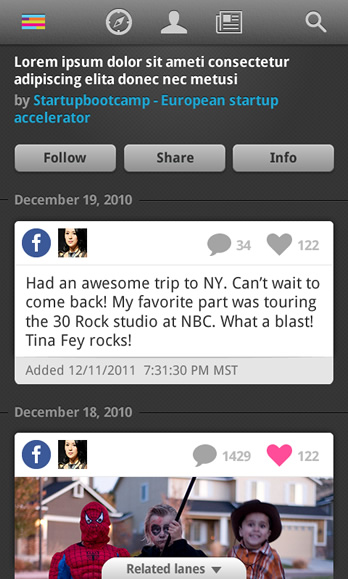
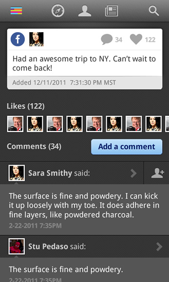
Image three: A lane in the Android app. Image four: The memo detail page in the Android app.
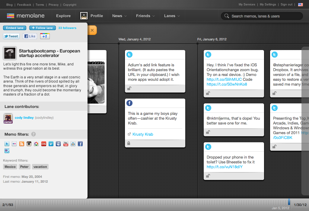
Image five: A typical lane view in the desktop app. (I help define the visual look of most of what you see here.)
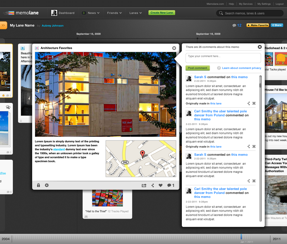
Image six: The interactions for adding a comment to a memo.
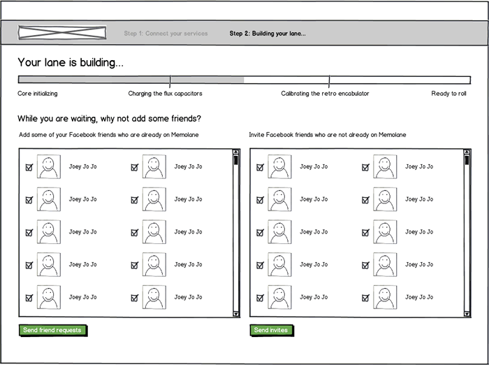
Image seven: Wireframe of the 2nd step in the sign up process in the desktop app.
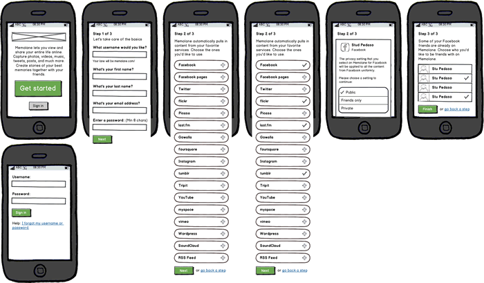
Image four: Wireframes of the sign up process in the Android app.