06/10/10 : 1 comments
Gmail mobile action button fix
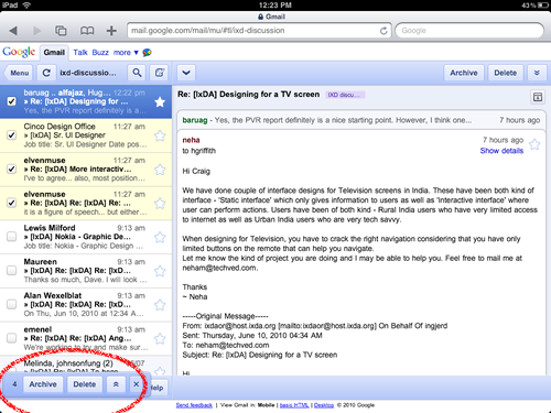
There’s a lot of things I like about using the mobile version of Gmail on my iPad, but the placement of the action buttons when you have more than one email selected drives me nuts. It looks out of place and is very difficult to spot the first time you use it. You can see where they put it in this image:

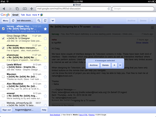
I think those action buttons should be in the preview pane. It’s impossible to miss (especially when blacked out) and you certainly don’t need that area when you’ve got more than one email selected. While I think that would be enough to solve the problem, I’d go a step further and disable the buttons on the top right. They only affect individual emails and shouldn’t be enabled. See what I mean?

